timeline purple flowers pink flowers ← Back← 返回
Click on the years below to explore projects

(2025 recommended)

点击年份查看项目(建议从2025年看起)
My Projects
← About Me← 关于我 → Works with me!→ 与我合作 2020 2020 2021 2021 2022 2022 2023 2023 2024 2024 2025 2025 ongoing
2020
Born in the shadow of the pandemic, rising from zero.疫情之年,从零开始。
DynasynQ
Brand BuildingBilingual ContentVisual IdentityContent Creation
品牌建设双语内容创作视觉识别系统内容创作

Not every seed gets planted in good weather. In the first year of the pandemic, I chose MedTech as a fresh graduate. From visuals to copywriting to investor decks — I built the brand's entire communications presence from scratch, alone. Some of that work is still there.

并非所有的种子都在好天气中种下。

疫情第一年,我作为应届毕业生选择了医疗科技。从视觉到文案到投资者演示稿,一年内独自完成了品牌从零到一的全部传播内容。那些内容至今还活在品牌里。

2021 →
2021
Studying IP, observing a seed break through.我开始研究 IP,就像研究一粒种子如何破土。
Miro & Wujo
IP StrategyCharacter World-BuildingLaunch Campaign
IP策略角色世界观搭建营销落地
As a child, I always wondered how certain characters find their way into an entire generation's childhood. In 2021, I found my answer — by building one. Miro & Wujo had a look. They didn't yet have a soul. So I built one, then designed the ecosystem to bring them to market. They went on to collaborate with Vans.
小时候我总想知道,那些能住进一代人童年里的角色是怎么诞生的。2021年,我遇见了 Miro & Wujo——一对由设计师 LiN 手绘了七年的潮玩情侣 IP。它有形象,但还没有灵魂。于是我从内到外定义了它们的性格与情感世界,并搭建了完整的上市生态。后来它与 Vans 联名了。
← 20202022 →
In the heaviest year of China's lockdowns, I chose to create in the cracks.疫情封控最严重的一年,我选择了在缝隙中创作。
Jiamin
IP StrategyBrand IdentityContent StrategySocial Media
IP策略品牌识别系统内容策略
I love seeing my friends shine. This year, I teamed up with Jiamin; we both believe the body is the first unit of freedom. Born during the 2022 lockdowns, our mission uses dance to help numb youth reconnect with themselves. I built the ecosystem to bring her movement culture to young people across China.
我喜欢看见朋友身上闪闪发光的点。这一年,我和一个用身体表达的朋友Jiamin一拍即合。我们都相信同一件事:身体,是自由最初的单位。在疫情封控最严重的2022年,我们立下了一个很大口气的使命——通过舞蹈,帮助那些将麻未麻的年轻人,找回身心的自然状态。于是我为她搭建了一个传播生态,让身体舞动的魅力和movement culture传播给中国的年轻人。
Brook & Breeze
Brand BuildingContent StrategyCommunity & EventsCopywriting
品牌搭建内容创作社群营运
Brook & Breeze lives with conviction. Known for its handcrafted bamboo bicycles and a decade of passion-driven making, it was a brand I believed in before I even joined. As the third full-time member, I built the brand's voice — and six bamboo frames, until my thumb gave out. This one was personal.
Brook & Breeze是一个活得有信念感的品牌,它最初以自制竹子单车著称,背后有十年以上以热爱驱动的自发创造。作为第三位全职员工,我负责品牌内容与传播——同时也是工坊里的单车女师傅,亲手做了六个以上的竹子框架,做到拇指变形。这段旅程,很特别。
← 20212023 →
2023
The year I fully build my own world.这是构建完全属于自我世界的一年!
SunTouch Studio
Brand BuildingProduct DesignIndependent Creative Practice
品牌建设产品设计独立创意实践
Born from a lifelong passion for craft since fifteen, SunTouch is a world of my own—deeply rooted in the anarchist ethos that "sunlight shines upon all things equally." Within this space, I interweave botanical painting, artisanal embroidery, and regenerative orange-peel paper. It is slow practice: where meaning precedes aesthetics, and trust outweighs algorithms.
SunTouch 是一个完全属于我自己的世界。自十五岁爱上印染与手作,我始终着迷于无政府主义里那句最朴素的信念:阳光平等照耀万物,不分贵贱,不论排名。在这里,我将植物绘画、手工刺绣与再生材料(如橙皮手工纸)交织在一起。这是一种刻意选择的"慢":意义走在美学前面,信任重过流量。
← 20222024 →
2024
A Year Immersed in Design.死磕设计的一年
Humble Being
平凡身体
Brand IdentityVisual DesignLogo DesignBrand Strategy
品牌识别系统品牌视觉系统
Perfect order is but a cage for vitality. While most wellness brands chase a standardized refinement, I choose to go against the grain, seeking to translate the "clumsiness" inherent in the human form.This kinetic energy may not align with precise algorithms, yet it carries the authentic scale of life. It is an invitation to the body: Stay raw, stay vivid.
完美的秩序是约束生命力的象征。当大部分身心品牌在追求标准化的精致时,我选择反其道而行之,试图翻译那份属于身体的“笨拙感”。 这种动感虽然不符合精密的算法,却有着真实的生命刻度。它无需向世界证明什么,它只是存在着。这不是一套视觉规范,而是一封寄给身体的邀请函:不必一板一眼地精准,也能鲜活地动起来~
Bright & Beautiful
有灵且美
Editorial DesignPublication DesignNon-profitVolunteer
装帧设计非盈利志愿者
Navigating an amorphous brief, I spent nine months as a solo designer and strategist constructing a 10th-anniversary legacy book for a Chinese NGO. From strategic vision to the typographic precision of 130+ pages, I designed every single page to ensure a decade of grassroots impact was not merely documented, but viscerally felt through the craft of design.
这个项目我投入9个月时间,在缺乏设计语言的公益环境下,为支持中国乡村女童成长的组织,构建出这本记载了 10 年心血的特刊。从视觉策略到 130 余页的字体微调,我独立完成了全书设计,确保这十年的女性赋能历程不仅是被“记录”,而是能通过纸张的质感被真实地“感知”。
← 20232025 →
2025
Getting my hands dirty in the field. 极度接地气的一年。
Wellcome Digital Marketing
Wellcome全球数字营销
Brand StrategyKOL/KOC Campaign ManagementCross-cultural Marketing
品牌搭建KOC/KOL广告项目管理跨文化营销
In 2025, I led content strategy for 15+ top-tier Bangkok brands, bridging internal logic and external growth. My "Double-Door" framework, blending strategy with emotion which dissolved cultural borders, helping brands resonate in China while staying true to Bangkok’s local spirit for every traveler.
2025年,我管理与执行了 15 个以上曼谷头部品牌的内容营销,涵盖国民级商场与美妆标杆。这是一次高强度能力整合的实践,对内,我需要从零构建海外营销品牌的底层逻辑;对外,则深度运转多维的客户业务,通过“双开门”逻辑,既助力海外品牌精准切入中国市场,也让曼谷的本土灵魂在中国游客心中落地生根。
← 2024End →
Glutrac / DynasynQ — MUG
Case Study · 2020–2021 · Hong Kong
案例研究 · 2020–2021 · 香港
1 YearDuration1 (me)Team SizeHong KongLocation
1年项目时长1人团队人数香港地点
Brand BuildingVisual IdentityBilingual ContentContent StrategyPhotographyCopywriting
品牌建设视觉识别双语内容内容策略摄影文案创作

Context

In 2020, when the world suddenly cared about monitoring their own bodies, I was already building the brand for a company that let them do exactly that. Glutrac, by MedUnion Global (MUG), was developing a non-invasive continuous glucose monitoring device for diabetic patients. Its sister product, DynasynQ, added real-time temperature monitoring — suddenly, urgently relevant in a world taking temperatures at every doorway.

The technology was there. The product was real. What the brand completely lacked was any infrastructure to communicate it. I was hired as a fresh graduate. I became all of that.

The Challenge

Two audiences. Two languages. One person.

MedTech brands serving chronic illness patients face a particular communications problem: the audience is emotionally burdened. Clinical language creates distance. At the same time, Glutrac was pitching to investors at international trade shows like CES — an audience that needed credibility, precision, and global fluency.

What I Built

WeChat — 14 Articles
Written in Chinese, built to treat patients as people — not a diagnosis.
Instagram — Bilingual Feed
English and Chinese content on a single grid — product education, CES coverage, World Diabetes Day campaigns.
Video — Promotional Scripts
Full narrative arc for the "Parent Edition" campaign, built on the insight that adult children underestimate how alone their aging parents feel.
Visual — Photography & Design
Commercial product photography, live exhibition coverage, and full deck design across multiple industry events.
Web — English Copywriting
Written directly in English — not translated — for the DynasynQ international-facing site.
Decks — Investor Presentations
Designed and structured pitch decks presenting the MUG brand, product lineup, and market positioning.

What This Showed

→ Strategic and executional responsibility simultaneously — no creative director, no brand guidelines, no precedent.
→ Cross-cultural fluency: knowing what resonates differently in Chinese vs. English-language contexts — not as translation, but as strategy.
→ Full-stack brand production: writing, photography, design, video scripting, web copy, and investor decks — all from one person, in year one of her career.

项目背景

2020年,当全世界突然开始关注身体监测时,我已经在为一个能够实现这一功能的品牌构建形象了。MedUnion Global (MUG) 旗下的 Glutrac 当时正在研发一款为糖尿病患者设计的无创连续血糖监测设备。其姐妹产品 DynasynQ 则增加了实时体温监测功能——在那个进出任何门口都要测量体温的世界里,这一功能瞬间变得极其紧要。

技术是现成的,产品是真实的。但品牌完全缺乏将其传播出去的基础设施。作为一名应届毕业生,我被聘用了,并成为了那套"基础设施"的全部。

面临的挑战

两个受众群体,两种语言,一个人。

服务于慢性病患者的医疗科技品牌面临着特殊的传播难题:受众承受着沉重的心理负担。临床术语会产生距离感。与此同时,Glutrac 还需要在 CES 等国际贸易展上向投资者进行推介——这群受众需要的是公信力、精准度以及全球化的语言表达能力。

我构建了什么

微信 — 14篇长文
用中文撰写,旨在将患者视为"人"而非"诊断结果"。
Instagram — 双语账号管理
在同一个排版矩阵中管理中英双语内容——涵盖产品科普、CES 活动报道及世界糖尿病日专题活动。
视频 — 宣传脚本
为"父母版"活动撰写了完整的叙事弧线,核心洞察是:成年子女往往低估了年迈父母的孤独感。
视觉 — 摄影与设计
商业产品摄影、展会现场报道,以及多个行业活动的全套演示文稿设计。
网页 — 英文网站文案
直接以英文撰写(而非翻译),用于 DynasynQ 面向国际的官方网站。
演示稿 — 投资者推介
设计并构建了展示 MUG 品牌、产品线及市场定位的商业计划书。

成果与展现

→ 同时兼顾策略与执行的能力:在没有创意总监、没有品牌指南、没有先例的情况下独立完成。
→ 跨文化流利度:深谙中英文语境下不同的共鸣点——这不仅仅是翻译,更是策略。
→ 全栈品牌制作能力:在职业生涯的第一年,独自承担了文案、摄影、设计、视频脚本、网页文案和投资者演示稿的所有工作。
Miro & Wujo (迷肉弧蕉)
Case Study · 2021 · China Designer Toy Market
案例研究 · 2021 · 中国潮流玩具市场
LAMTOYS / WAZZUPfamilyClient2021YearChinaMarket
LAMTOYS / WAZZUPfamily合作方2021年份中国市场
IP StrategyCharacter World-BuildingLaunch CampaignContent StrategyChannel Management
IP 战略角色世界观构建发布策略内容策略渠道管理

Context

China's designer toy market was at its absolute peak. Blind boxes were everywhere. Pop Mart had just gone public. Everyone was launching an IP. Most of them looked good. Almost none of them had anything to say.

Miro & Wujo had been hand-drawn by designer LiN since 2014. China's first couple IP of its kind. What it didn't have yet was a soul. That's where I came in.

The Problem I Solved

I found the answer in a feeling most young urban Chinese people knew but hadn't named: 不想长大. The refusal to grow up. That became the emotional core of everything.

What I Did

IP World-Building
Defined Miro and Wujo's personalities from the inside out — giving them emotional depth before visual polish.
Strategic Positioning
调高爱的饱和度 — turn up the saturation on love. A positioning that cut through a saturated market.
Launch Campaign
Full launch strategy across four phases — pre-heat, release, peak, and extension.
Channel Management
WeChat, Xiaohongshu, and Instagram — managed simultaneously with platform-specific content.

What This Demonstrated

→ The ability to define a brand's emotional core before the market tells you what it should be
→ Strategic positioning in a saturated, trend-driven market
→ Full-funnel IP thinking: from character world-building to platform content to exhibition activation

项目背景

当时的中国潮玩市场正处于绝对巅峰。盲盒无处不在,泡泡玛特刚刚上市,似乎每个人都在推出自己的 IP。大多数产品看起来都很精美,但几乎都没有触及灵魂。Miro & Wujo 是由设计师 LiN 自 2014 年起手绘创作的,作为中国首个此类"情侣 IP",它当时唯独缺少一个"灵魂"——而这正是我介入的切入点。

我解决的问题

我在大多数中国都市青年都有、却尚未被命名的情感中找到了答案:不想长大。这种对成长的拒绝,成为了所有表达的情感核心。

我的具体执行

IP 世界观构建
由内而外定义 Miro 和 Wujo 的性格与情感世界,让他们在视觉之前先有灵魂。
战略定位
"调高爱的饱和度" —— 在饱和的市场里找到一个能被记住的情感坐标。
发布活动
涵盖预热、发布、爆发和延伸四个阶段的全方位上线策略。
渠道管理
同步运营微信、小红书及 Instagram,针对各平台输出差异化内容。

能力证明

→ 前瞻性的定义力:在市场给出定义之前,率先精准捕捉并定义品牌的情感核心
→ 极度饱和市场的战略突围:在趋势驱动的红海市场中实现差异化竞争定位
→ 全链路 IP 思维:从角色世界观构建,到平台内容创作,再到展会活动落地激活
Jiamin — IP Strategy & Launch
Case Study · 2022 · Independent Commission · Shanghai
案例研究 · 2022 · 独立委约项目 · 上海
3 MonthsDuration1 (me)Team Size0 → 10K → 33KFollowers
3个月周期1人团队规模0 → 1万 → 3.3万粉丝增长
IP StrategyCultural TranslationBrand IdentityContent StrategySocial Media
IP 战略文化转译品牌识别内容策略社交媒体运营

Before the Strategy

From 2017 to 2022, I watched young people across different cities in China standing still at concerts — enjoying the music, but rarely moving. Bodies present, but too shy to dance. So I started moving first. Not to prove anything, but because responding to good music with your body is an instinct we are all born with.

Then I met Jiamin. She had never stopped dancing — not for an audience, not for an algorithm, not for anyone's approval. Simply for the joy of it. We weren't client and strategist. We were two versions of the same instinct. Two souls who had walked their own paths for years and arrived at the same conclusion: the body is the first territory of freedom.

The Mission

Five years of pandemic had compressed something into a collective state — not fully numb, but no longer free. What we wanted to do was simple and radical: to pass the energy of movement to young people in China, especially those whose bodies had been held down by the weight of those years, hovering somewhere between alive and numb. To remind them that dance is not a performance that requires years of training — it is an instinct we are all born with.

The Work

Jiamin was a dancer who had never needed to market herself — because she had never stopped moving long enough to think about it. I was someone who loved to dance, but had spent years learning how brands find their people. Between us, we had everything: the soul, and the system to carry it.

I built the strategy, the brand identity, and the content ecosystem from scratch. Not from data, but from lived experience. The framework wasn't designed in a meeting room — it was felt, first.

At the same time, I knew that sustaining a creative life requires more than content. So I designed two commercial entry points: first, curating intentional outfit and music choices within her online content — with copywriting that highlighted both — to attract brands that shared the same values and aesthetic sensibility; second, offline workshops as a monetisation touchpoint and community anchor.

Competitive Analysis

Brand Identity

Content Framework

Social Media Roadmap

The Result

0 → 10K
Followers in three months
80% Viral Rate
Organic content spread
33K Total
Media interviews & brand partnerships followed,nd so did brand partnerships with Labelhood, NEIWAI, Lululemon.

But the real result was less measurable: people started moving again.

策略之前

从2017年到2022年,我在中国不同的城市看到了大部分年轻人站在演出现场享受音乐,却很少舞动。身体在场,却羞于舞。于是我先跳了起来,不是为了证明什么,而是用身体和好听的音乐互动是一种天生的本能。

后来我遇见了家敏。她从未停止跳舞,不为观众,不为算法,不为任何人的认可,就单纯享受。我们不是甲方和乙方,我们是同一种本能的两个版本。两个独自走了很久、却得出同一个结论的灵魂:身体,是自由最初的疆域。

我们的使命

疫情五年,压抑在身体里积累成了一种集体状态:不是完全麻木,但也不再自由。我们想做的事情简单而激进:把舞动的能量传递给中国年轻人,尤其是那些被疫情压住、将麻未麻的身体。提醒他们,律动不是经过高度练习才能拥有的表演,它是我们天生自带的本能。

我做了什么

家敏是一个从未停止跳舞的人,正因如此,她从来没有停下来想过如何营销自己。而我,是一个热爱跳舞、却花了多年时间研究品牌如何找到它的人。我们之间,拥有一切所需:灵魂,以及承载它的系统。

我从零开始搭建策略、品牌识别与内容生态——不是从数据出发,而是从亲身经历出发。这套框架不是在会议室里设计出来的,它是先被感受到的。

同时,我也深知内容可持续(生计)的重要性,因此设计了两个商业切口:其一,在线上内容中展示讲究的穿搭与音乐,并在文案中将其highlight,吸引相似价值观和调性的品牌;其二,以线下工作坊作为变现与社群连接的落点。

竞品分析

品牌视觉

内容框架

社媒节奏

项目成果

0 → 1万
三个月内粉丝破万
80% 传播率
自发病毒式传播
3.3万粉丝
媒体采访与品牌合作随之而来(比如蕾虎\内外\Lululemon)

但最真实的结果无法被数字衡量:人们开始动起来了。

Brook & Breeze — Brand Building from the Ground Up
Case Study · 2022 · Shanghai
案例研究 · 2022 · 上海
3 MonthsDuration1 (me)Team Size100K+Impressions
3个月周期1人团队规模10万+曝光量
Brand BuildingContent StrategyCopywritingCommunity & EventsSocial Media
品牌建设内容策略文案撰写社群与活动策划社交媒体运营

Context

In 2022, while most brands were chasing virality, Brook & Breeze was quietly building something real — handcrafted bamboo bicycles made in a Shanghai workshop, backed by over a decade of passion-driven craft. The brand had heart. It had community. What it needed was a system to carry that conviction further, and a voice that matched the integrity of what its hands were making.

The Work

I handled brand content and communications across social media, wrote the copy, ran the community, and helped organise the Nike collaboration ride. But the work I'm most proud of happened on the workshop floor — I built over six bamboo bicycle frames with my own hands, until my thumb gave out.

Bamboo Bicycle Production

Design & Copywriting

Community & Workshop

The Result

100K+ Impressions
Media coverage in Shanghai Daily and Sixth Tone
Nike Collaboration
They came to us — cultural credibility beyond the cycling niche
3 Months
One person wearing every hat

Some brands live so honestly, the big names come to the door themselves.

项目背景

2022年,当大多数品牌都在追逐流量,Brook & Breeze 在安静地造一件真实的东西——在上海工坊里手工打造竹子单车,背后有十年以上以热爱驱动的自发创造。品牌有温度,有社群,有灵魂。它需要的,是一套能承载这份信念的系统,以及一个和它双手所造之物同样真诚的声音。

我做了什么

我负责社交媒体内容创作与传播、文案撰写、社群运营,并协助策划了 Nike 联名骑行活动。但我最骄傲的事发生在竹子单车生产车间里——我亲手做了六个以上的竹子车框,做到拇指变形。

竹子单车制作 & 生产

设计与文案

社群活动 & 自行车厨房 Workshop

项目成果

10万+ 曝光
获得《上海日报》和《第六声》深度报道
Nike 联名合作
Nike 主动找来——品牌影响力成功破圈
3个月
一个人承担了所有职能

有些品牌,活得足够真实,大品牌自己会走过来。

SunTouch Studio
Case Study · 2023 - till I die· Independent
案例研究 · 2023 - 老了还做· 独立创作项目
IndependentType2023–till I dieDuration1 (me)Team Size
独立项目类型2023年-老了还做时间长度1人团队规模
Brand BuildingProduct DesignPrint DesignHandcraftCommunityIndependent Creative Practice
品牌建设产品设计印染设计手作工艺社群经营独立创意实践

01 · The Core Philosophy

"Sunlight shines upon all things equally."

SunTouch is rooted in the most elemental core of anarchism — sunlight does not discriminate; it illuminates all things. Within this logic, beauty needs no proof, and creation needs no algorithmic validation. One rule was established: Meaning Before Aesthetics. Rejecting centralized definitions of taste, returning to the absolute freedom of individual creation. SunTouch is not just a brand — it is a radiant proposition for living.

02 · The Deep Practice

A lifelong obsession with handcraft and print since fifteen, materialized into every stitch and mark. Independently developed orange-peel regenerative paper — from pulping fruit fibers to sun-drying — a full-chain practice from waste to emotional artifact. Even the brand's digital presence was hand-coded, so that the warmth of craft could survive into the screen.

Print Design

Lorem ipsum dolor sit amet, consectetur adipiscing elit. Sed do eiusmod tempor incididunt ut labore.

Craft

Lorem ipsum dolor sit amet, consectetur adipiscing elit. Sed do eiusmod tempor incididunt ut labore.

Self-made Package Paper(Orange Peel Paper)/p>

Lorem ipsum dolor sit amet, consectetur adipiscing elit. Sed do eiusmod tempor incididunt ut labore.

03 · The Results

Sold-out Before Promotion
Zero ads, zero pre-heat. Pure vitality as the only distribution channel.
Break-even Month One
Proof that high emotional-value products can convert with zero marketing spend.
Trust Over Algorithms
When a brand is built on soul rather than noise, resonance becomes the most efficient distribution channel.

01 · 核心哲学

"阳光平等照耀万物。"

SunTouch扎根于无政府主义最朴素的内核——阳光不挑剔,它照耀万物。在这个逻辑里,美不需要被证明,创作不需要被算法认可。确立了一条规则:意义先于美学。拒绝中心化的审美定义,回归个体创作的绝对自由。SunTouch 不只是品牌,更是一个"明明晃晃"的生命提案。

02 · 深度实践

从15岁起对手作与印花的迷恋,物化为每一寸线迹。自主研发橙皮再生纸,从果皮纤维的打碎到阳光下的晾晒——从废弃物到情感载体的全链路实践。甚至亲自编写前端代码,让品牌的数字呈现依然保有手工的温度。

印花

Lorem ipsum dolor sit amet, consectetur adipiscing elit. Sed do eiusmod tempor incididunt ut labore.

手工

Lorem ipsum dolor sit amet, consectetur adipiscing elit. Sed do eiusmod tempor incididunt ut labore.

自制橙皮包装纸

Lorem ipsum dolor sit amet, consectetur adipiscing elit. Sed do eiusmod tempor incididunt ut labore.

03 · 项目成果

未宣先售
零广告、零预热,依靠生命力流溢实现现象级反响:小红书帖子平均500+点赞藏
第一个月回本
证明高情感价值产品的硬核商业变现力
信任重于算法
当品牌建立在灵魂而非杂音之上,共鸣就是最高效的分发渠道
Humble Being - Brand Identity
平凡身体 - 品牌设计
Case Study · 2024 · Freelance Commission · China
案例研究 · 2024 · 自由职业委约项目 · 中国
FreelanceType2024Year2,456Podcast Subscribers
自由职业类型2024年份2,456播客订阅量
Brand IdentityLogo DesignVisual DesignBrand StrategyMind-Body Wellness
品牌识别Logo 设计视觉设计品牌战略身心健康

Thoughts beofre designing

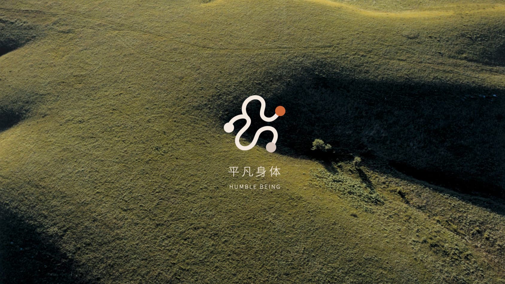
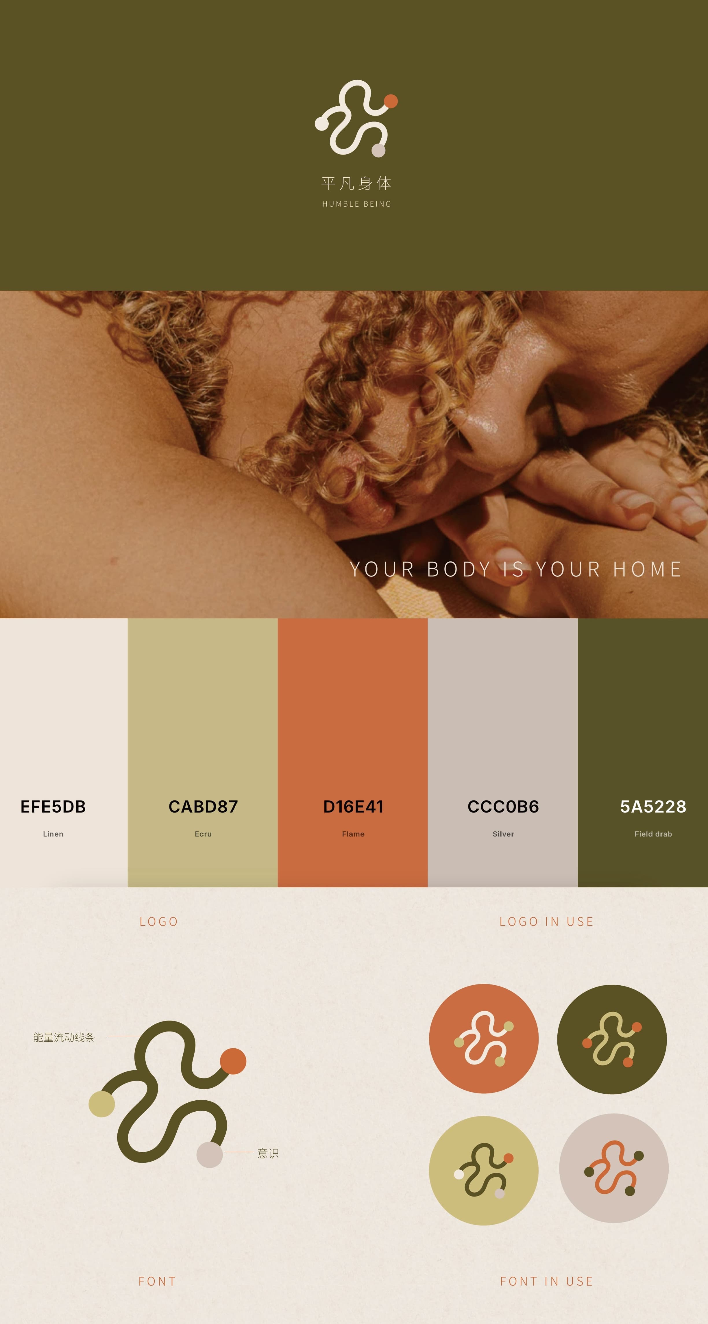
Humble Being is a soulful collective that challenges the conventional standards of "excellence" and "mediocrity," encouraging a return to authentic life experiences and our primal, natural state.

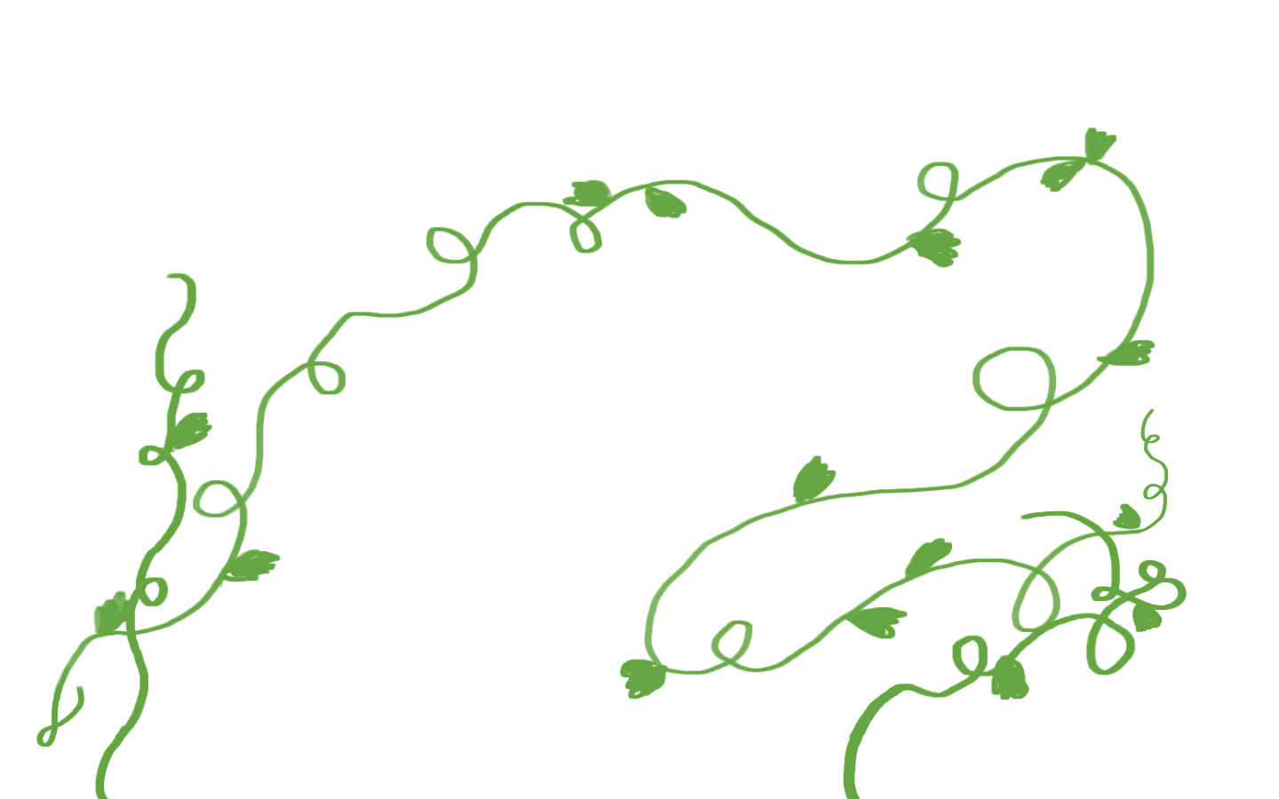
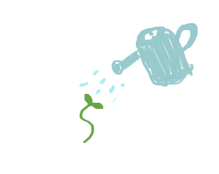
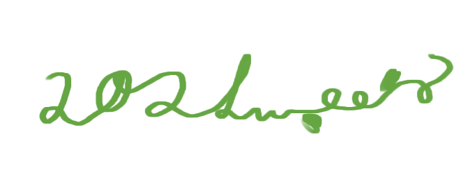
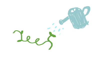
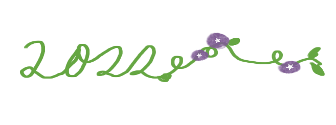
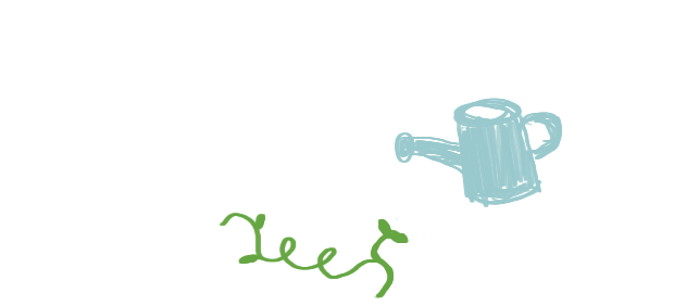
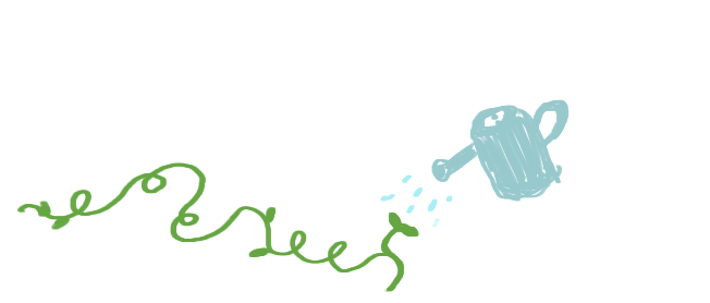
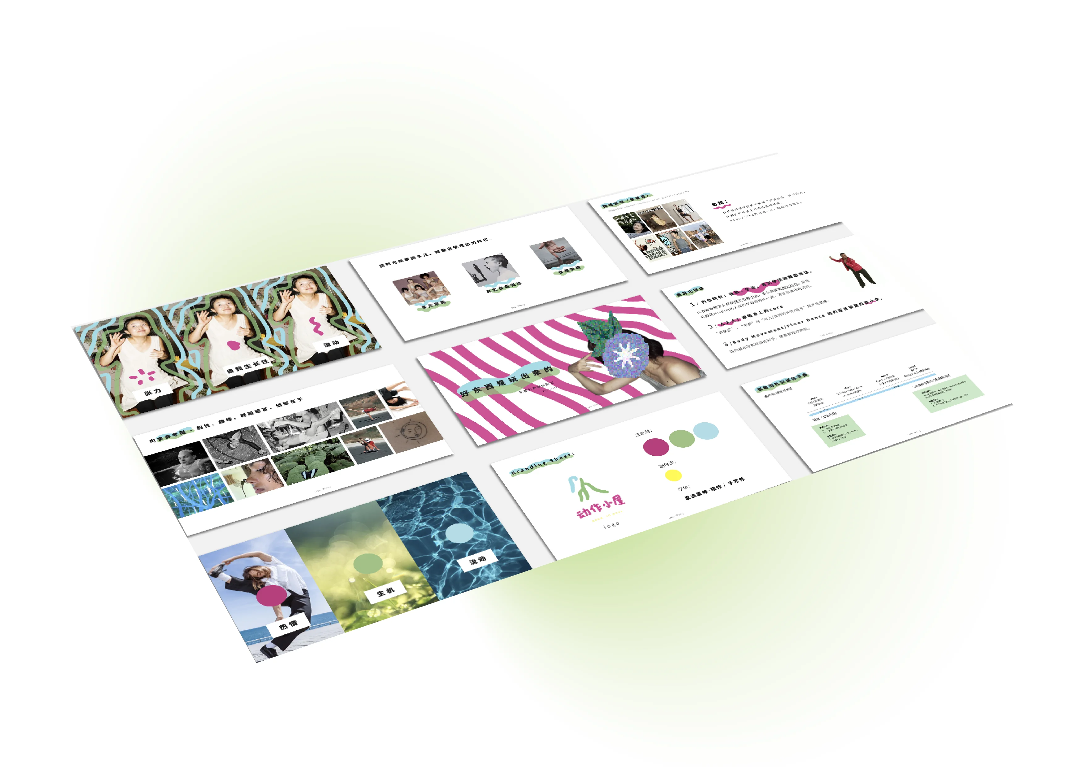
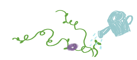
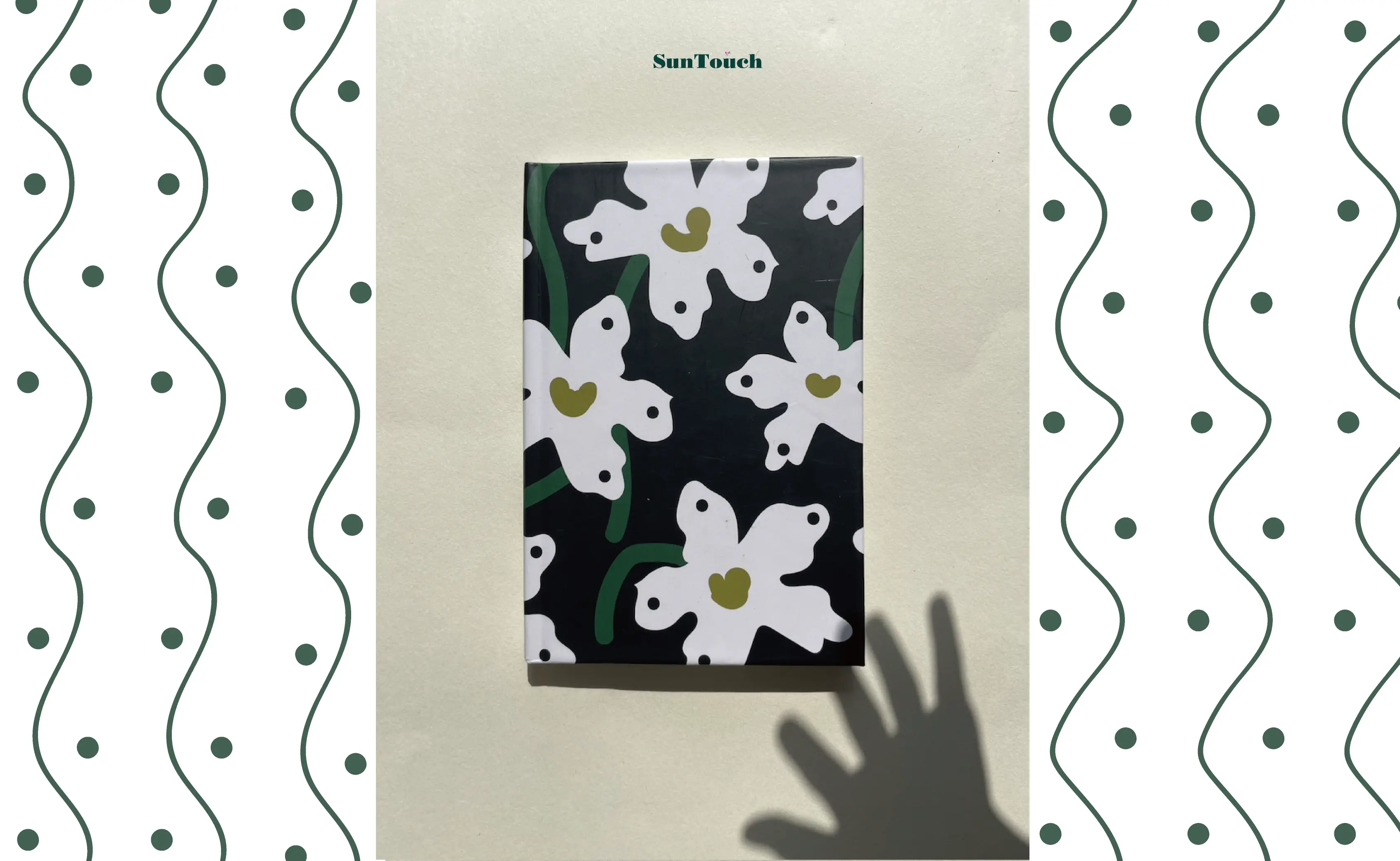
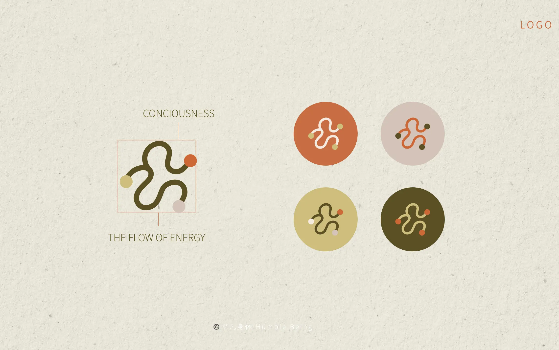
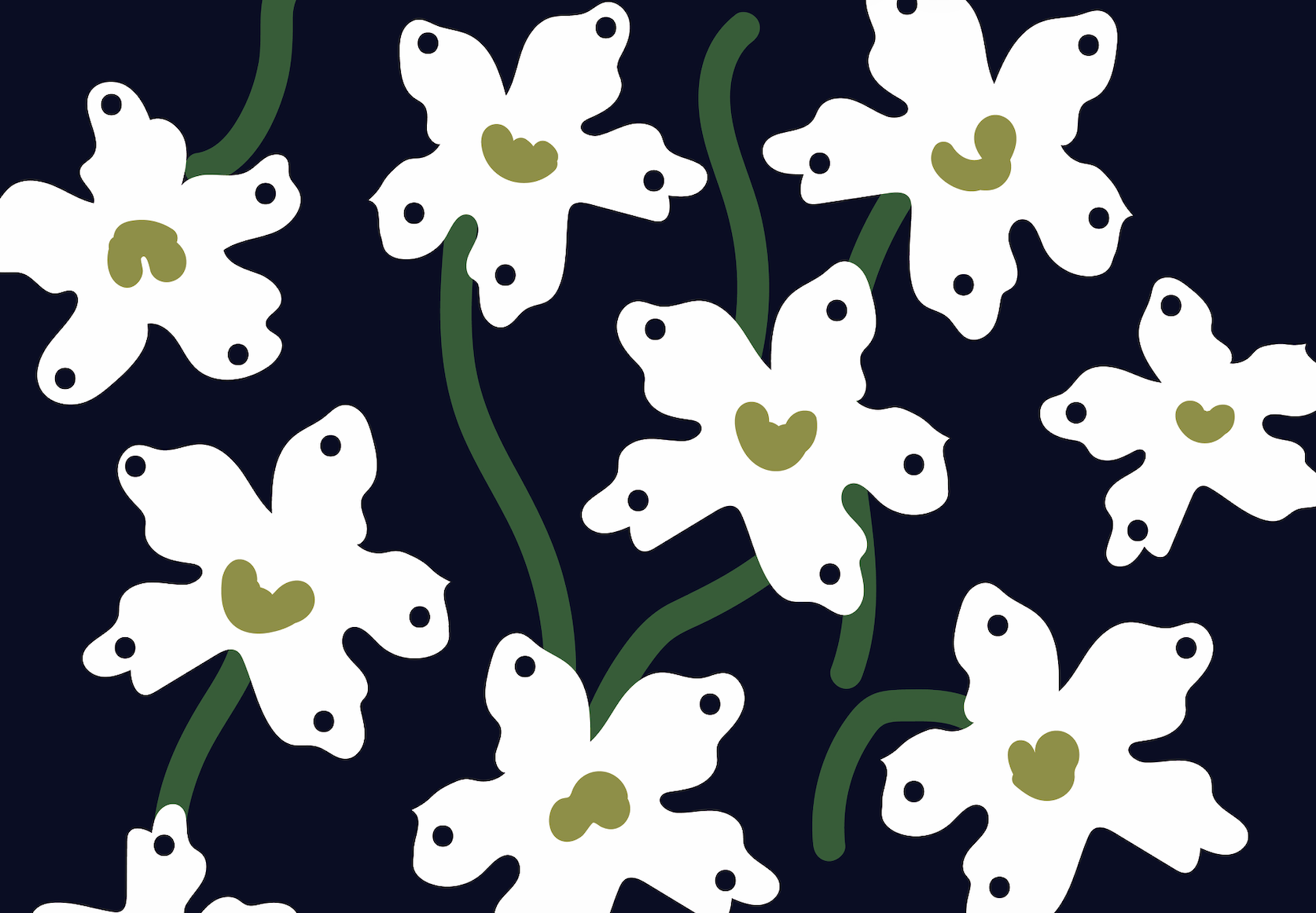
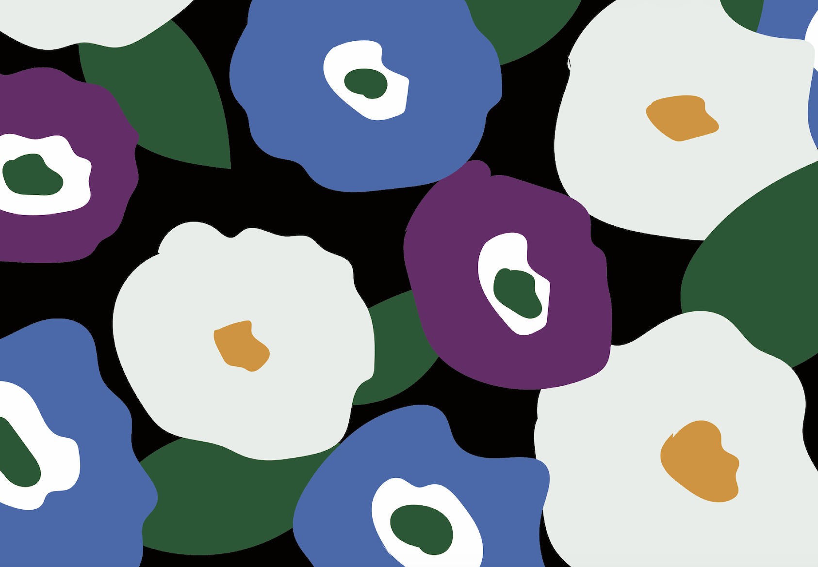
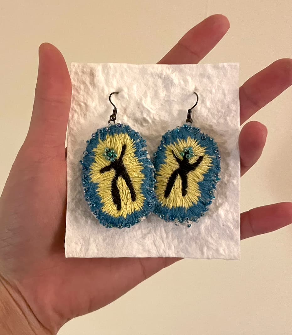
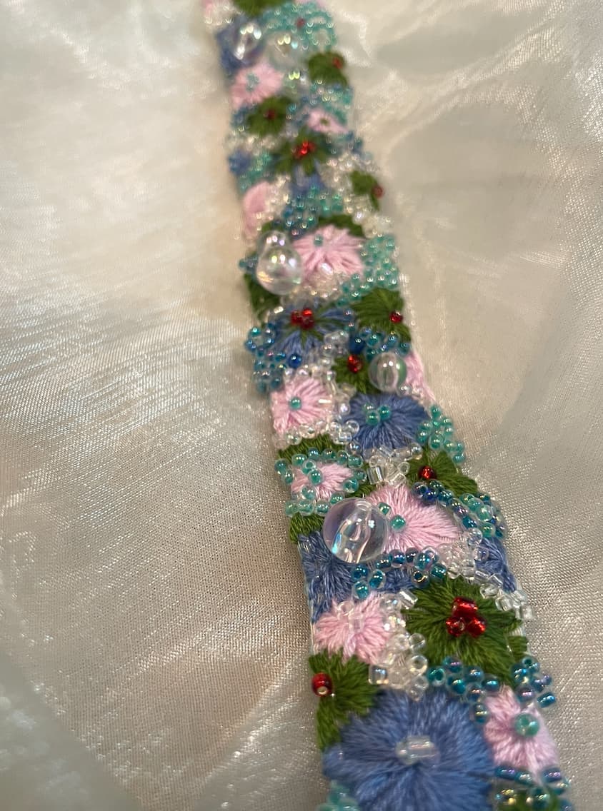
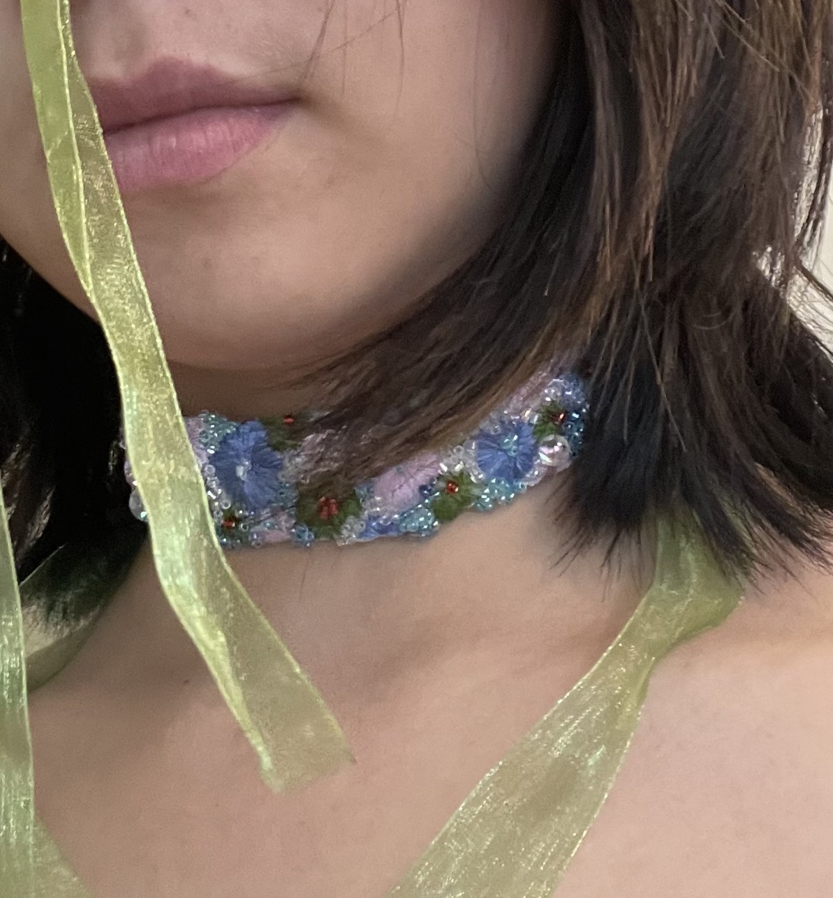
In the visual construction of Humble Being, I sought to capture the intuitive essence of "Where awareness goes, energy flows." Moving away from the rigid grids and "perfect proportions" typical of wellness brands, the logo embraces a fluid, expansive vitality akin to yoga and dance. I anchored the intersection of body, mind, and spirit with three distinct colors, weaving two kinetic energy lines into a jubilant, dancing form. These intertwined curves are also a visual translation of the profound friendship between the founders, Jess and Qingzhi—two souls who traveled their own paths for years before deciding to "dance together" once more.

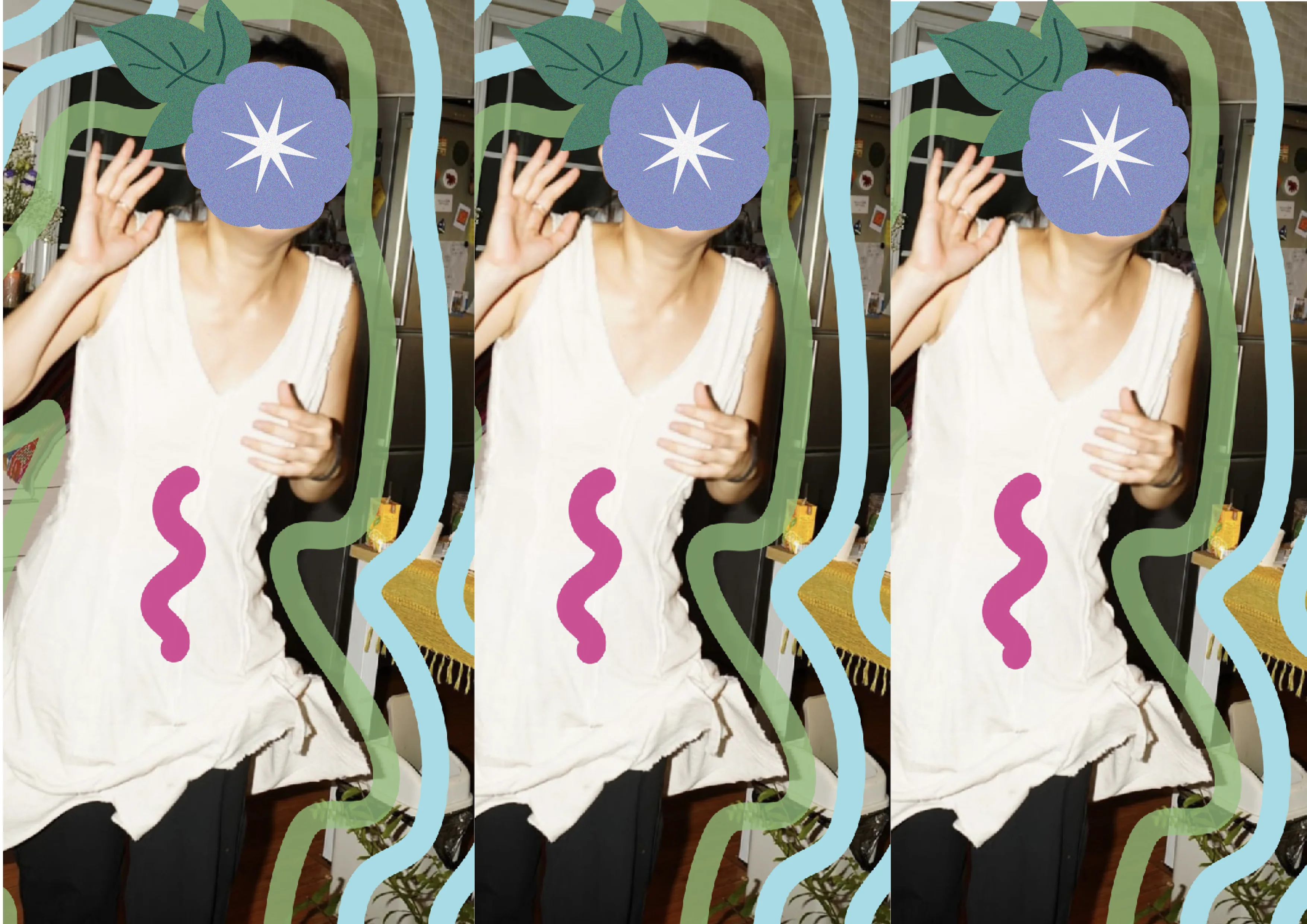
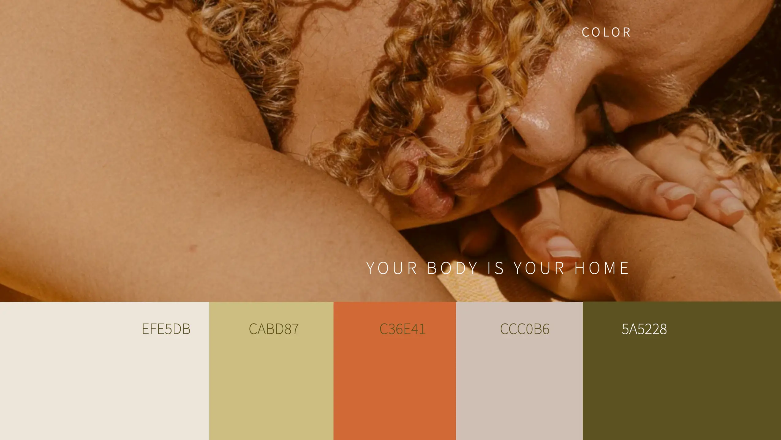
In contrast to the cold, sterile, and almost "stainless steel" aesthetic that dominates the wellness industry, we have built a palette rooted in skin, earth, and natural force. We reject that detached "high-end" coldness in favor of "earth-born" hues that convey an intimate, grounded warmth with a subtle touch of joy. This visual language is not meant to define a beauty standard, but to resonate with every real breath, fostering a sense of "Being in your body." It is an invitation to slow down in this vast, unknown world, return to your physical self, and simply enjoy the feeling of being you.

Deliverables

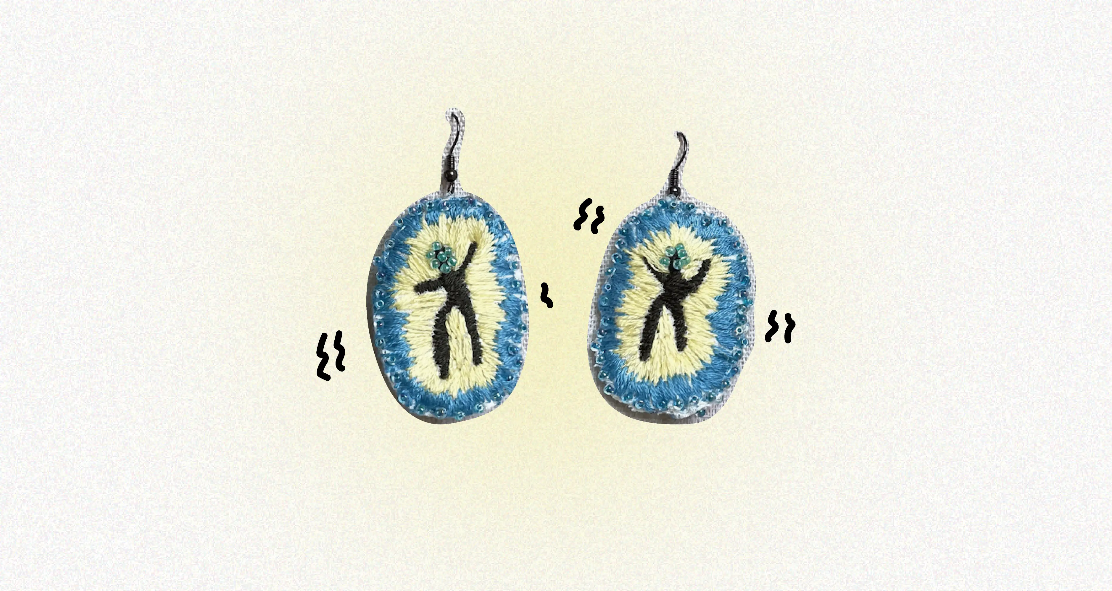
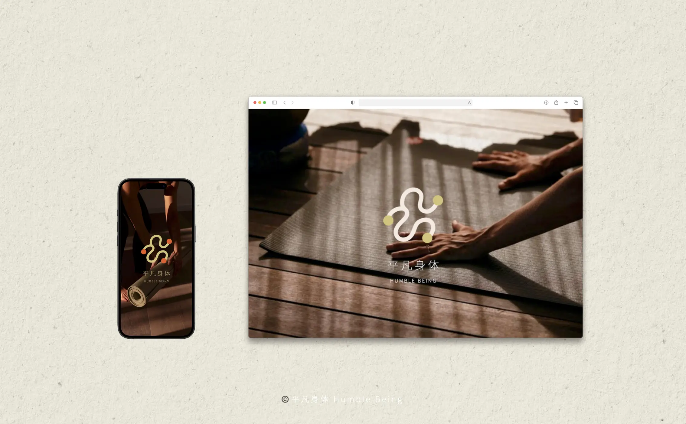
Full Brand Identity System
Logo, colour palette, typography, brand-in-use applications, and brand guidelines.
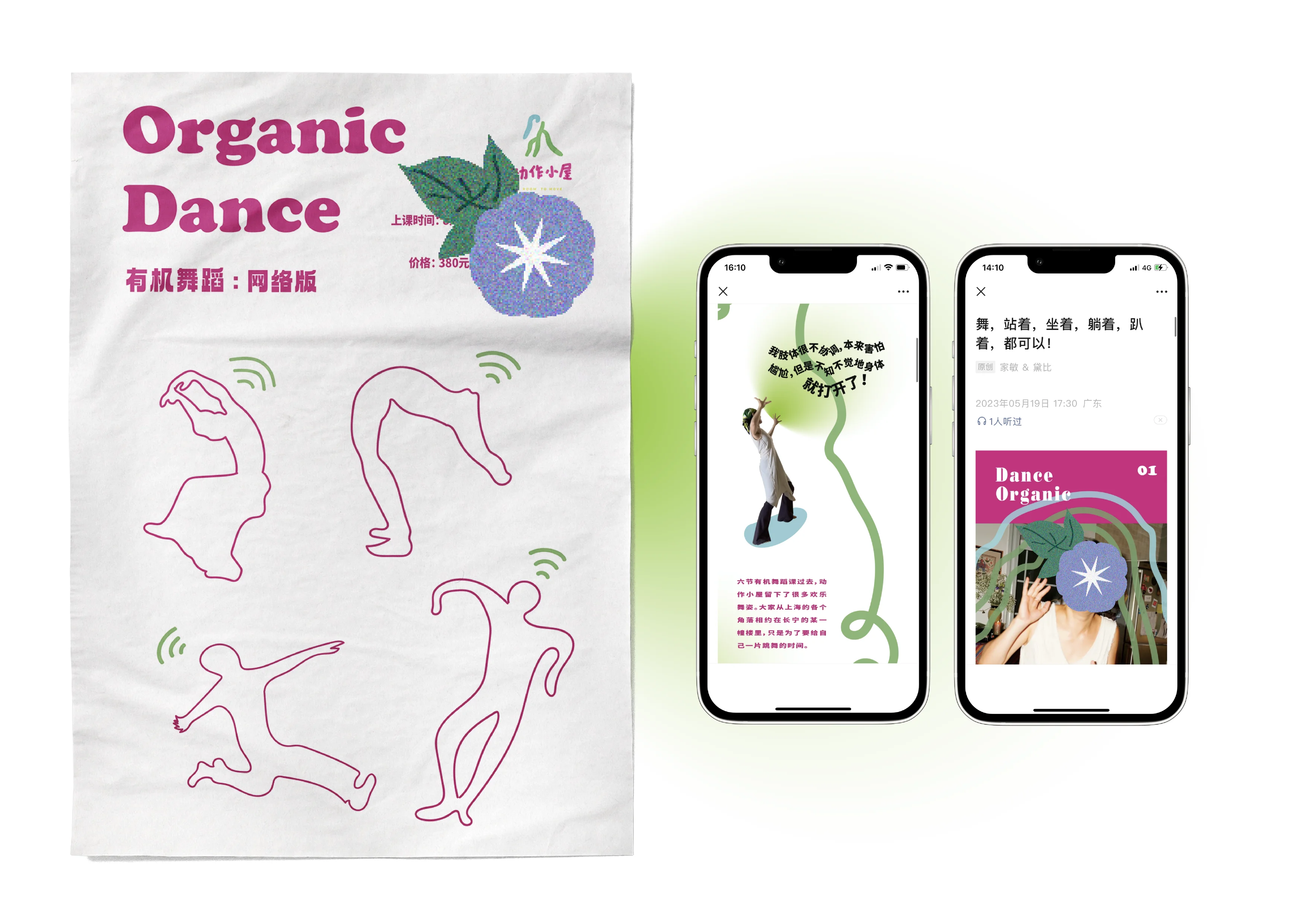
Podcast Cover Design
Now serving a show with 2,456 subscribers and 47 episodes.
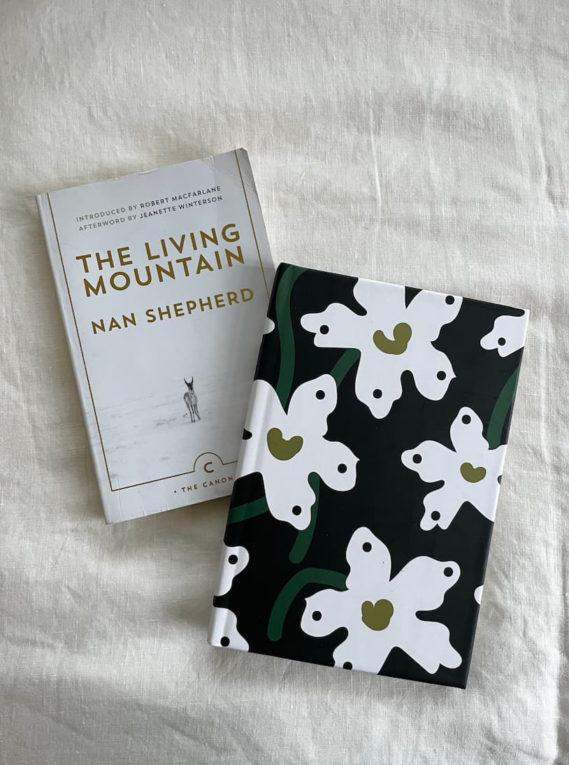
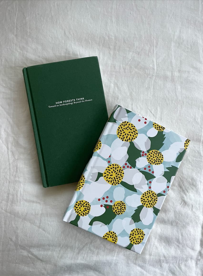
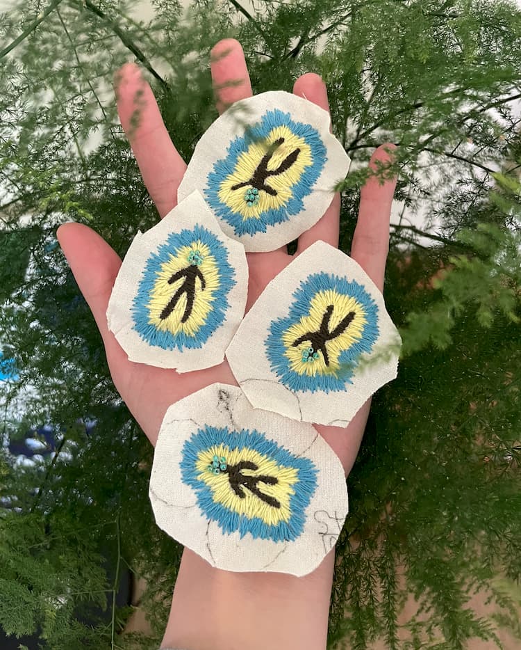
Photo

Humble Being Brand Identity

设计思考

平凡身体 (Humble Being)是一个反思“优秀”和“平凡”标准的身心共伴联盟,它想要鼓励我们回到内在真实的生命经验,回归到一个自然的状态。

在「平凡身体 (Humble Being)」的视觉构建中,我试图捕捉一种「心向何方,力随而往 (Where awareness goes, energy flows)」的直觉体验。Logo 设计打破了传统身心品牌对“精密网格”与“完美比例”的执念,转而追求一种如瑜伽与舞动般流动舒展的体感。我以三种色彩锚定身体、心理与灵性的意识交汇,通过两条轻盈的能量线条,编织出一个欢腾律动的生命个体。这两条交织的曲线,亦是我对品牌主理人 Jess 与清之深厚友谊的视觉转译——那是两个独立的生命在各自奔走多年后,于事业旅途中的再次“共舞”。

区别于主流康养行业那种如“精致不锈钢”般冰冷、克制、触手生寒的视觉逻辑,我们构建了一套扎根于皮肤、大地与自然原力的色板。我们拒绝这种缺乏体温的“高级感”,转而通过「天生地养」的朴实色彩,传递一种与生命接触的亲密质感,并赋予其微小而真切的雀跃感。这种视觉语言不为定义某种审美标准,而是为了呼应每一次真实的呼吸,营造一种 “Being in your body” 的温暖归属。

交付成果

全套品牌识别系统
包括 Logo、标准色、标准字、应用效果及品牌视觉指南。
播客封面设计
为目前已更新 47 期、拥有 2,456 名订阅者的播客节目提供视觉支持。

图集

Humble Being Brand Identity
Bright & Beautiful — 10th Anniversary Publication
有灵且美 — 10周年纪念出版
Case Study · 2024 · Volunteer Commission · China
案例研究 · 2024 · 志愿者委约项目 · 中国
9 MonthsDuration130+ PagesPublication200 CopiesPrinted
9个月周期130+页出版物200册印数
Editorial DesignPublication DesignVisual StorytellingNon-profitVolunteer
编辑设计出版物设计视觉叙事非营利组织志愿者项目

About the Project

Bright & Beautiful is a non-profit organization dedicated to empowering adolescent girls in rural China. For a decade, they have nurtured young lives in remote mountainous regions through arts education and body-positive empowerment. They believe every girl deserves to embrace her own radiance and live a life of dignity and beauty, no matter how humble her surroundings.

Privileged to be the designer for this 10th-anniversary special issue, I helped visualize their ten-year journey through a physical book, bridging warmth and sincere love to adolescent girls across the country.

What I Made

I designed every single page independently, ensuring that this decade of female empowerment was not merely "recorded" as data, but could be viscerally "perceived" through the tactile reality of paper.

Project Resilience: The proven capacity to anchor a complex, long-term creative marathon—from inception to print—entirely alone.

Final Outcome: A complete 130+ page editorial system; 200+ limited edition printed copies.

photos

项目序言

“有灵且美”是一家深耕中国乡村、专注支持青春期女童成长的公益组织。十年来,她们通过艺术教育与身体赋能,守护着大山深处那些如野花般顽强生长的生命。她们相信,每一个女孩都值得拥抱属于自己的光芒,在生活中活出尊严与美。而我有幸成为该组织10周年特刊的设计师,通过实体书籍帮助她们呈现着10年的路程,把温暖与真诚的爱传递给更多女孩们。

我的产出

我独立完成了全书每一页的设计,确保这十年的女性赋能历程不仅是被作为数据“记录”,而是能通过纸张的质感被真实地“感知”。同时,这个项目也需要有强大的耐力,我掌控从构思到印刷的全周期和长时程工作马拉松。

最终成果:130+ 页完整设计编辑;200 本+限量纸质特刊。

图集

Wellcome Digital Marketing
Wellcome全球数字营销
Case Study · 2025 · Bangkok
案例研究 · 2025 · 曼谷
17Client Accounts5IndustriesBangkokLocation
17个客户数量5个行业覆盖曼谷核心阵地
Brand StrategyKOL/KOC Campaign ManagementCross-cultural MarketingVisual IdentityContent SystemsXiaohongshu
品牌战略KOL/KOC 营销管理跨文化营销视觉识别内容体系建设小红书运营

CONTEXT: The Architect in the Field

Wellcome is a Bangkok-based digital marketing agency focused on helping brands reach Chinese-speaking markets. In 2025, I joined as the team's first full-time strategist, and ended up running seventeen concurrent client accounts while building the agency's own brand from the inside at the same time. No playbook. No precedent. Just the work.

Some cases

What I Showed

4 6 8 10 Narrative Resonance · 9.5 Subculture Depth · 8.5 Aesthetic Intuition · 9.0 Strategic Logic · 8.0 Tech/AI Synergy · 8.5 Grounding/Execution · 9.0
Narrative Resonance9.5
Excavating historical texture, translating "aged" into premium value.
Subculture Depth8.5
A subculture diver — capturing real signals that data cannot digitize.
Aesthetic Intuition9.0
Pursuing organic texture, rejecting the manufactured consensus of industrial content.
Strategic Logic8.0
Precise positioning through search strategy and social sentiment mapping.
Tech/AI Synergy8.5
Using AI as a system translator to amplify overall delivery efficiency.
Grounding/Execution9.0
Managing 17 accounts simultaneously, building AI copywriting and SOP systems.

背景

Wellcome 扎根于曼谷,致力于连接国际品牌与中国市场。2025 年,我成为团队中第一位全职策略师。在那段日子里,我一边应对 17 个并行客户的复杂需求,一边在内部为这家机构亲手搭建品牌基石。没有现成答案,没有前车之鉴,只有嚯嚯干活!

部分项目

能力证明

4 6 8 10 叙事张力 · 9.5 跨界感知 · 8.5 审美直觉 · 9.0 策略逻辑 · 8.0 技术协同 · 8.5 实操厚度 · 9.0
叙事张力9.5
挖掘历史质感,将"陈旧"转译为溢价
跨界感知8.5
作为亚文化深潜者,捕捉不可数字化的真实信号
审美直觉9.0
追求有机质感,拒绝工业化的人造共识
策略逻辑8.0
搜索占位策略与社会情绪的精准卡位
技术协同8.5
将 AI 作为系统翻译官,提升整体交付效能
实操厚度9.0
统筹 17 个账号,建立 AI 文案与实践 SOP